Friday, 25 April 2014

15: Racing characters - caricature 'blokes'

My first drawings taking on the Festival were concerned with caricature. I decided to look at how to I could represent the ubiquitous male 'bloke' race-goer, a staple of the Festival, and underrepresented in my drawings, partly because they are everywhere and almost form part of the scenery. I drew this grim-looking chap from my imagination: 


This was somewhat inspired by the sinuous weirdness of Feliks Topolski's drawings. Topolski had a fine knack of bridging the gap between caricature and observational drawings by employing a free, fluid line when drawing figures from life. 


The drawing on the left was an unfinished study from life drawn at the races. I liked the face which was well observed and tried to fill in the gaps and simplify into cartoon: 


An illustrator I have looked at previously for inspiration for my children's book and publishing projects in second year is Armin Greder. Swiss illustrator Greder has a sombre, expressive style especially suited to portraying alienation and loneliness - his book The Island is about a stranger who washes up on an island and is treated with prejudice and hostility by the inhabitants: 


His burly, dark-clad men more than a little bit remind me of the 'jeans and black jacket' crowd at the Festival - large, hostile looking men drinking pints and looking gradually more threatening as the day wears on. Here are a pair of them: 


Drawn again more boldly in pen and ink with goache and in a more simplified manner. The aim is to portray latent menace: 


...

Tuesday, 22 April 2014

14: Change of direction

With my FMP assuming priority during the build-up to the Cheltenham Festival, and the Portfolio and Promotion module soon after, there was a bit of a Research Experiment hiatus. When I returned to it, the shopping concept had become a bit stale. I decided that since the races were fresh in my mind, I would approach them with the same set of objectives.

With a few weeks of reflection on events I felt I had an angle on the Festival worth exploring. As my drawing during the event was at least partially directed by looking for what I considered suitable material for Cotswold Life magazine, I steered a little clear of overt satire during race week. The crowds actually made it difficult to be able to see people clearly enough to draw them.

There are several journalistic 'angles' one might take with the Festival. A racing insider might want to look at the horses and grooms, stables and parade-ring. I am not a racing insider. A topographical draughtsman might survey the crowds and enormity of the occasion. I felt more comfortable with a satirical - even moralistic - take on the Festival and its culture of excess. It can easily be seen as a big excuse for over-indulgence.


Wednesday, 19 February 2014

13: Experiment #8 part 2 - Monster Composition

Look out, it's Godzilla!


Bit of a joke there.

One commonly sees a monster from below, thus inspiring awe and fear at its sheer monstrous scale. This was the tactic employed by the Japanese makers of the early Godzilla films, which helped to disguise the fact that the monster was actually a man in an unconvincing suit. My next experiment concerned the role of perspective. What would certain perspectives and configurations contribute to how my image reads and what it communicates?

I drew my brand figures onto coloured paper and cut out some shapes to represent shop shelving and pillars. I then played around with composition, sticking them down and photocopying the various outcomes:

(N.B. These images look VERY DARK in Blogger due to the lame Picasa image hosting. The background in reality is white!)


1: The Godzilla perspective. We are almost at rooftop height here. The ceiling line is low, giving us a sense of the creatures' height.


2: Here, the perspective is shifted lower, but the creatures need to loom higher into the sky for fear to be further inspired. The creature on the left appears too small.


3: Here, we look directly across from a similar height at the creatures. The ceiling looms into the sky, giving a sense of an enormous hall. We can see the creatures in entirety. They are facing away from each other: not communicating, but consuming!


4: The ceiling line is lowered, and the creatures' size and proximity to us emphasised.


5: This arrangement contains the most number of objects within the store. There is a sense of distance but co-operation between the figures.


6: Here, the larger figure is almost about to step off-stage, like it is lumbering past.


7: Here, the figures' size within the space is emphasised, with the lower ceiling height.


12: Experiment #7 part 1 - Brand monstrosities

This was an experiment with a more overtly political overtone - coming at the shopping work from a different angle. I'd just started to read an interesting book called Stitched Up: The Anti-Capitalist book of Fashion and had a few ideas floating around in my head. I decided that instead of focussing on shoppers I'd flip the scenario and depict giant monstrosities representing luxury brands 'shopping' for human consumers. When we go shopping and purchase these items, bombarded by advertisements, are we freely choosing goods that we desire, or is the stronger force actually the brands' need for us to continue purchasing their goods in order that they can continue to exist? Are they, in reality, actually shopping for us? 

I cannot answer these questions. 

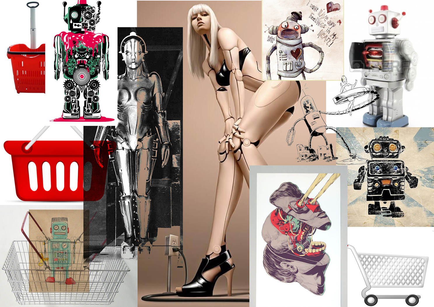
Nonetheless this seemed to be an appropriate avenue for exploration. My initial idea was for several robot-like figures, incorporating some of the elements of the various brand tropes and 'identities', such as they are. I did some brief and painful research and cobbled together some A3 printouts of advertising images and reference I could use back at my internet-less bunker. Like a 13-year-old girl's mood board: 


I was vaguely inspired by Gerald Scarfe during this experiment. Scarfe's distinctive approach is similar in intent to Steadman's but more commonly applied to specific political figures or, in the case of his Pink Floyd work, political abstracts. His work commonly takes on monsters with monstrous creations, employing a sinuous line to the nth degree of exaggeration. With the Nixon drawing below, he morphs a Watergate tape reel into the recognisable face of the disgraced US president: 


I had a sort of golden, Metropolis-like robot figure down as my Dior character, but initial drawings proved difficult. I imagined it grabbing multiple people at once in clawed hands, and depositing them in enormous shopping bags. 


I felt these looked a bit 1920s. My monster had to be representative of the modern fashion conglomerate. I tried to create a more organic monster, and after a page full of scribbles, arrived at something successful only after starting one drawing so close to the side of the page I had to make its head go backwards, like in the Exorcist. This suited the horrifying purpose, so I went for it. As if it's moving through the store, and just when you think it's gone by and you're safe, the head swings round and its arm comes backwards to grab you! 


This is also a lot closer to a caricature of the Charlize Theron featured in the Dior adverts. I tried to do a similar job on Chanel but, lacking much visual reference except for handbags, met with limited success. This is a bit lame:


The Gucci monster works quite well however I think, a squat, avian figure, ridiculous in black and white outfit and designer shades:


I tidied this image up. 


I wanted to give the monsters something to shop for, so thought I'd create some 'human' brand names with a bit of bad calligraphy. 'MENSCH' being German for people, and 'Ordinaire' French for, ah, ordinary.


I tried to put these figures in context of a massive department store, populated by static, product-like human beings. I will experiment with the composition of the image in the next post. 


Friday, 24 January 2014

11: Experiment #6 - Christmas Shopping

I felt like I had to do a big piece after all those little drawings, so did this, which is more or less a picture of the Promenade in Cheltenham, using some of the techniques I was working on with the other drawings: 


It ended up being a Christmas picture, complete with snow! Which didn't actually happen. I had some fun making a collage of various bits and pieces I scavenged from the Christmas catalogues. I then cut this up again and re-arranged it, then photocopied it onto grey paper for the Cavendish House shop window displays. This was my one concession to breaking up correct perspective/representational drawing in this piece. The rest of the image is a conventional 'scene' albeit observed from a slightly higher viewpoint with grizzly looking shoppers shambling past with their shopping bags. 

This was quite a fun drawing to do and took me about an evening. I like the people and the shop displays, anyway, which combine a bit of collage, coloured paper and pen and ink with some painty bits. 


I stuck some text on this as if it were for a magazine article. It looks fairly horrible but I'm no layout expert. The title you'll agree is a masterpiece:


It could also be made into a really great Christmas card:


Tuesday, 21 January 2014

10: Experiment #5 - Retail Therapy


This experiment turned into an exercise in creating a drawing for editorial. It's not the most polished drawing but the idea is there - a crowded picture of shoppers employing some of the techniques - wonky angles, distorted scale, grisly characterisation and expressions and some bright garish colours:


I realised the empty space at the top - which I was struggling to fill - might allow me to put a magazine headline in!


The drawing is a bit grubby for editorial and needs cleaning up but there's the germ of an idea there:


Saturday, 18 January 2014

9: Wednesday Workshop #4 - Adbusters Illustration

These were both generated in response to a series of quotes from Adbusters magazine collated by Fumio... ' teach my son how to use a gun' and 'time to be alone, space to move about, these are the great scarcities now'. These were supposed to lead to creating an image suitable for editorial in the Adbusters context. I mangled Goya: 


And did some shapeless bio-morphs:


This led to considering images designed to fit the editorial context.