Thursday 1 May 2014

21: Evaluation

This project has thrown up a number of different directions and possibilities for me, none of which I was perhaps able to fully develop but several of which may prove fruitful avenues in the future.

Ultimately, I think one learns the most through drawing, through trying different things with drawing, and there is always more of this to do. I think I would have liked to have produced a more conclusive final set of images, although I think there is enough here to suggest what that might have looked like.

Looking back at the early experiments to do with consumerism, I think there is certainly scope for more development and further research. Dealing with challenging topics that alight on different and difficult issues is not easy, and I feel that my responses possibly fell in between several stools - that of direct, cartoon satire, in the traditional sense, and the possibilities of collage and subverting advertising imagery. Future experiments might further consider the use of text in such work and the word/image dynamic, as well as compositional tools and techniques to communicate meaning. A consideration of a wider range of artists might have helped this process.

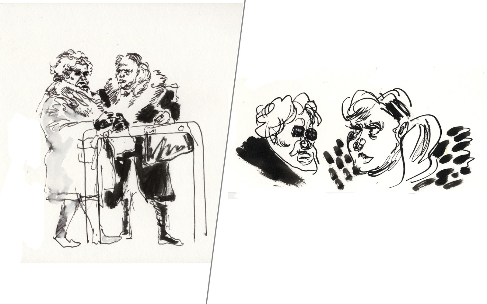
The later experiments with the races are less complex and more to do with caricature. This is an area I feel relatively comfortable in by comparison but the drawings still enabled me to express something about the Cheltenham racing experience that eluded me in the FMP observational drawings. Further experiments might consider more daring and expressive ways of drawing, now that the groundwork for the main characters has been established.

Overall I feel that the project, while in a creative sense as interesting as the others in the year, suffered somewhat due to being picked up and dropped so frequently due to other deadlines and the imperatives of my FMP. With a chance to have, for example, a month to work on the project solidly having digested some of the early experiments, I believe I may have been able to get into some good things. As it is, I feel I have barely scraped the surface of what it might be possible to do with some research and experimentation around these themes.

AGS 01.05.2014

20: Experiment #13 - Parade Ring

One of the drawings I wanted to do all year of Cheltenham races but never managed was a view of the parade ring including both horses and a variety of spectators. It's impossible to get the angle, for one thing, and spectators tend to be facing the wrong way - i.e. looking at the horses, so you just get a load of hats staring back at you. Which could be a good picture for the right sort of illustrator, I suppose, but I wanted some faces. The closest I got were the following drawings: 


I also combined a couple of drawings for one of the screen prints I made for the FMP: 


I wanted to come at it from a different angle, as if you were looking down on the parade ring at a sort of 45 degree angle, and include a cross-section of Cheltenham 'types' including some of the characters I'd been working on for the project thus far. I came up with this: 


I introduced some tone with hatching and some splatter. The mistake I made here is with the fingerprint shading on the horse - this makes it look like a piebald, which you never see as they're not thoroughbred racing horses, even though there is one in Hidalgo


To rectify the horse section, I stencilled out the area and added some ink splatter shading, which made it look like he's coming back from the race - perhaps explaining the look on the jockey's face - it's evidently muddy ground. This also has the effect of differentiating the horse and rider from the rest of the scene:


I felt that to go all out and paint in the various shades of beige being likely worn by the punters would be too much. I felt that a spot colour, like with the previous experiment and also my FMP screen prints, could work with the line drawing. Spot colour is an old trick mainly to do with conserving ink and thus money in printing, but is still widely used. The Canadian illustrator Isabelle Arsenault is fond of using spot or limited colour as a way of highlighting and differentiating certain elements of her mostly pencil drawings:


The Cheltenham yellow colour would do the job of the beige and create quite a bold impact I felt.
I rolled an A3 page with acrylic paint, then scanned this and isolated some areas with photoshop:


I tried out various photoshop filters, as is the eternal temptation:


I wasn't that pleased with these, and felt there'd be a stronger sense of design with a flat area of colour: 


This is a slight variant with some grey, almost veering into blue:


Some variants:


I think these two are my favourites:


This experiment represented a bit of a change for me as it's a fairly involved drawing in more of a graphic novel or commercial style. I enjoyed trying to fit in some of the characters I'd observed at various points during the year, as well as invent a few new ones. I'm not sure who the jockey is; he looks a bit shell-shocked. The guy in the bottom left came to talk to me when I was drawing on Ladies Day during the Festival and he was interested in the young ladies I was drawing, so I put him next to a nice young lady. There are some blokes with Guinness just above them. The couple in the top left standing over the rail I saw getting happily drunk at the bloodstock auction I went to earlier in the season. The old granny in the bottom right I caught sulking after a race at the January meeting. I'm not sure what comes across to the observer who doesn't know these (exciting) connections but I hope there's a fair amount of narrative happening in the picture.

19: Experiment #12 - The 'Awful Face' of Cheltenham

I decided to produce some 'final pieces' for the Races experiments, and decided to start with a scene I'd observed at the Festival. These three were observing events from a balcony in the Grandstand, looking out over the crowds near the parade-ring. I was able to lean against a low wall more or less directly opposite them and, because they were above me, observe them closely. They seemed to me representative of the 'loadsa money' variety of spectator common at the Festival, smoking cigars, drinking liquor and often on their mobile phones, having 'important' conversations. Probably owners of workhouses or similar. I actually drew them fairly faithfully at the time, including the guy on the right who clocked me drawing him: 

I thought these three would be deserving of an attack so set to work with pen and pencil. I again had Ralph Steadman in mind here; his work with Hunter S. Thomspon on the Kentucky Derby way back in 1970 was a landmark of the reportage genre. The approach, in less-than-choice language courtesy of Thompson, was to set out to 'rape' the subject matter, at which Steadman's drawings excel:


Steadman's drawings make one look at these people in a new light; the entire enterprise appears venal and dissolute. What he'd make of the Cheltenham Festival I don't know, but it's fair to say that, in terms of the money, drink and disgraceful behaviour, it's always there if you look for it. I gave my characters big cigars (which they did have, I left them out before for Cotswold Life) and I put them on their mobile phones. The central character is leering horribly: 


I wanted to put in some areas of tone:


This is the drawing cleaned up and ready for colour:


I wanted to add some colour to bring out some contrast in the image; Cheltenham yellow/gold seemed appropriate and would emphasise the 'money':
I'm pleased with the final piece although it may be a bit close to Steadman. Well, Steadman said in interview 'We were looking for the awful face of Kentucky', and these are my awful faces of Cheltenham. Steadman wasn't there, so someone had to do it.

...

18: Experiment #11 - Horses!

Horses proved a fair challenge for me during the FMP, and my horse drawing, despite some practice, remains hit and miss. To caricature something generally requires an understanding of how to draw it properly, so this was going to be hard for me, indeed it so proved: 


The one in the top left isn't bad: 


This one is a bit strange also:


What I learnt from this experiment is the following:

1: If horses must be drawn, try to obscure as much of them behind objects, people etc as possible.
2: That's it.

17: Experiment #10 - Groups

Most people go to the races in groups, indeed this is a large part of the experience. I actually experimented with caricature of groups of racegoers earlier for the FMP, but was not particularly happy with the results: 


I revisited this concept first with drawings similar to those I finished the previous 'ladies' experiment with, using pencil and then pen and ink. The important thing is to get the interaction between the figures. I wasn't happy with the man on the right so drew him twice. He is a little overtly comic, I feel: 


These two are a little better - this is towards the end of a race, and the horse backed is probably falling back up the hill. This drawing has more movement in it and employs some of the techniques used by Steadman; ink splatter and pointy teeth to denote invective: 


I moved away from pencil outlines as I felt they were limiting my capacity for expressiveness with the pen. One of my favourite drawings done during the FMP was done of some punters at the December meeting using a calligraphic felt pen with a thick and thin end: 


This style of loose, expressive figure drawing laced with a degree of caricature owes something to Feliks Topolski, whose drawing I greatly admire: 


One of the key aspects to this approach is that the first lines put down stay there - there is no tracing of pencil lines. The line becomes how you express the character of the figure - internal and external, which brings it to life as representation and as artwork. The drawings below were put down with, respectively, various felt pens and, in the second drawing, dip pen and ink. 


I prefer this way of working which is only possible if you have a good knowledge of what you are to draw and can therefore take risks. One of the more amusing scenes I did manage to draw while I was at the Festival was of a couple of St Patrick's day hatters getting their photo taken with a strange pink-suited creature collecting money for breast cancer (top left): 


I thought this would be worth revisiting; gently anarchic: 


I used hatching and areas of solid tone in this drawing in a manner inspired by the black and white work of the excellent Nicholas de Crecy, fond of drawing slightly surreal scenes:


...

16: Experiment #9 - Ladies Day

It's notoriously difficult (for men at least) to caricature beautiful women. This experiment concerned a wide range of drawing styles and mediums in order to find something that might work. To begin my epic quest, I collated a couple of A3 sheets of drawings of ladies I'd drawn over the various meetings to use as reference:  


There was a nice quote by a journalist during Royal Ascot about how women's dress at the races can be pure female self-caricature. A big part of getting the right feel of the racing crowd is to get the clothes right. The illustrator Alyana Cazalet has some nice work which treads a line between fashion illustration and comic observation:


Her use of bright colour painted on quite loosely (perhaps at the beginning?) is a good trick to use with clothes. I tried this with some of the characters and outfits I'd observed:


This drawing done at Cheltenham in November didn't really need caricaturing - the ladies I observed have enough character already, but i couldn't resist: 


Some drawings done in a more simplified style of some mummies I'd seen at one of the meetings:


I discovered a nice unfinished drawing from the Festival of a pair of ladies - who I took to be authentic horse enthusiasts - sitting on a bench and doing some form study:


I thought I'd work on extending the caricature:


I put them into a scene here, though I couldn't be bothered with any other spectators:


To continue with the theme of groups and interaction, I had a look at some work by cartoonist/ caricaturist Sue Macartney Snape, no stranger to drawing upper-class women, and not afraid of sexy either (n.b. especially the last two):


Macartney Snape's tools are exaggeration of figure (Ronald Searle's skinny legs included), comically emphasised clothes, bright colour and insightful facial expression - her faces carry real personality. One of the interesting things about her work is that it is satire aimed very much at a particular class - they are both targets and consumers.

I did a couple of sheets of studies drawn in pen and ink with some brushwork of a rough cross section of the racing crowd, from young to old:


These are OK but I feel a bit 'generic', and could do with some colour and further development - see the next experiments.