I cannot answer these questions.
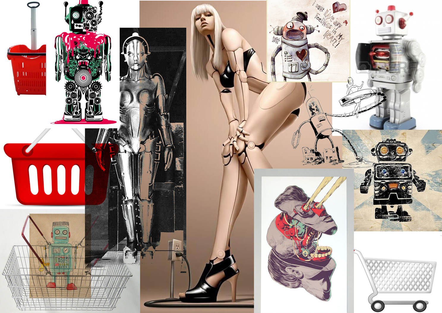
Nonetheless this seemed to be an appropriate avenue for exploration. My initial idea was for several robot-like figures, incorporating some of the elements of the various brand tropes and 'identities', such as they are. I did some brief and painful research and cobbled together some A3 printouts of advertising images and reference I could use back at my internet-less bunker. Like a 13-year-old girl's mood board:
 |
 |
|
 |
 |
I was vaguely inspired by Gerald Scarfe during this experiment. Scarfe's distinctive approach is similar in intent to Steadman's but more commonly applied to specific political figures or, in the case of his Pink Floyd work, political abstracts. His work commonly takes on monsters with monstrous creations, employing a sinuous line to the nth degree of exaggeration. With the Nixon drawing below, he morphs a Watergate tape reel into the recognisable face of the disgraced US president:
I had a sort of golden, Metropolis-like robot figure down as my Dior character, but initial drawings proved difficult. I imagined it grabbing multiple people at once in clawed hands, and depositing them in enormous shopping bags.

This is also a lot closer to a caricature of the Charlize Theron featured in the Dior adverts. I tried to do a similar job on Chanel but, lacking much visual reference except for handbags, met with limited success. This is a bit lame:
The Gucci monster works quite well however I think, a squat, avian figure, ridiculous in black and white outfit and designer shades:

I wanted to give the monsters something to shop for, so thought I'd create some 'human' brand names with a bit of bad calligraphy. 'MENSCH' being German for people, and 'Ordinaire' French for, ah, ordinary.

I felt these looked a bit 1920s. My monster had to be representative of the modern fashion conglomerate. I tried to create a more organic monster, and after a page full of scribbles, arrived at something successful only after starting one drawing so close to the side of the page I had to make its head go backwards, like in the Exorcist. This suited the horrifying purpose, so I went for it. As if it's moving through the store, and just when you think it's gone by and you're safe, the head swings round and its arm comes backwards to grab you!
This is also a lot closer to a caricature of the Charlize Theron featured in the Dior adverts. I tried to do a similar job on Chanel but, lacking much visual reference except for handbags, met with limited success. This is a bit lame:
The Gucci monster works quite well however I think, a squat, avian figure, ridiculous in black and white outfit and designer shades:
I tidied this image up.

I wanted to give the monsters something to shop for, so thought I'd create some 'human' brand names with a bit of bad calligraphy. 'MENSCH' being German for people, and 'Ordinaire' French for, ah, ordinary.
I tried to put these figures in context of a massive department store, populated by static, product-like human beings. I will experiment with the composition of the image in the next post.
 |
 |


No comments:
Post a Comment